Intelligent spinal interface
Bridging the gap on either side of a spinal cord injury

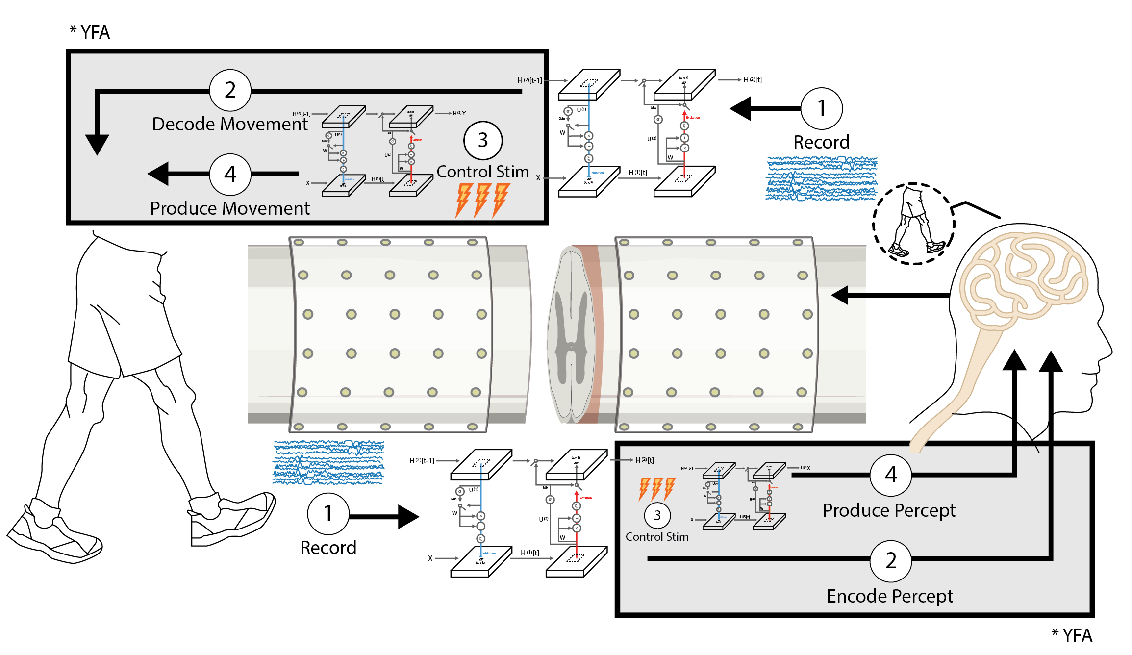
The Intelligent Spine Interface (ISI) is a clinical trial aimed at restoring lost function to people who suffer from a spinal cord injury. I have been working on various parts of this project for the last few years. The project is ongoing, and involves many related sub-projects. On this page, I’d like to showcase two analyses I did for a recent publication about sensing compound action potentials (ECAPs) from the surface of the spinal cord, in an animal model. You can read the entire paper here.

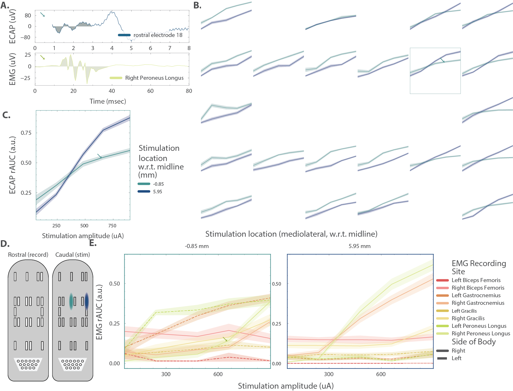
A Single trial data illustrating the temporal windows used to calculate the rectified area under the curve for the spinal ECAP (top) and EMG (bottom) The specific combinations of amplitude, recording channel and stimulating channel that evoked these responses are indicated by colored arrows in panels B, C and E, respectively. B Representative ECAP recruitment curves from the spinal ECAP collected on the rostral array, during stimulation at two sites on the caudal electrode array at a horizontal separation of 6.8 mm (the positions of the stimulating electrodes are illustrated in D). The layout of the plots matches the organization of the electrode array contacts (e.g., the top left plot represents the spinal ECAPs from the top left contact on the rostral array, etc.) C Detail from framed panel at the top right of B. D Illustration of the locations, on the implant, of the two stimulating electrodes. E Representative muscle recruitment curves from EMG collected bilaterally from 4 of the 6 muscles, during stimulation at the same two sites used for panel B.

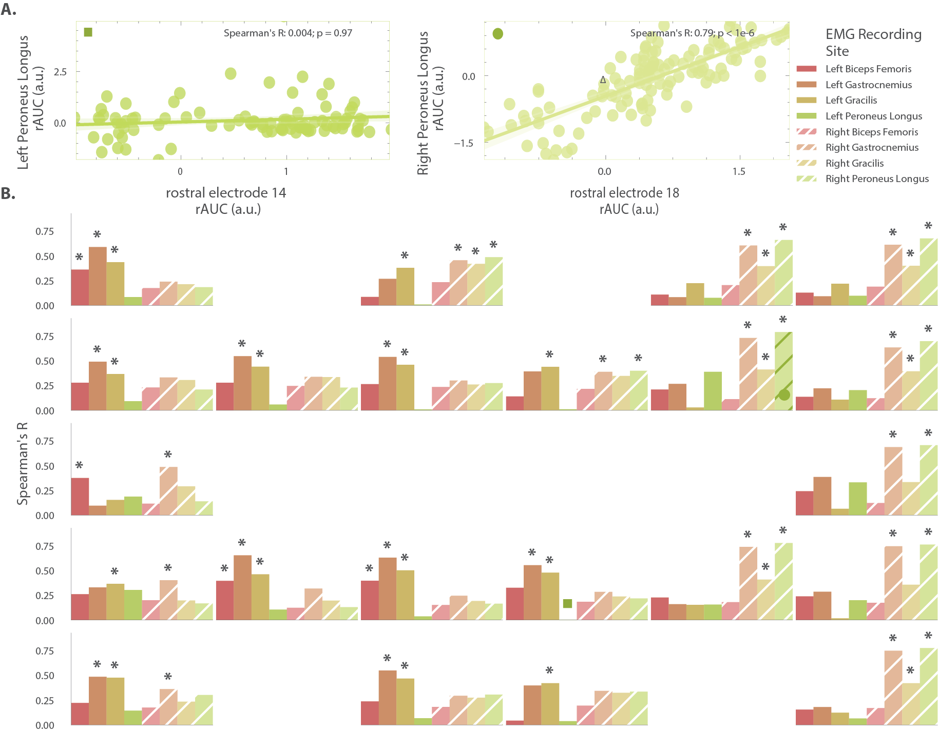
A Comparison of the rectified area under the curve values between pairs of signals taken, one each, from the rostral electrode array and the EMG from the left and right lower extremity musculature across multiple stimulation configurations. Individual dots represent the rectified area under the curve values from individual trials. For illustration, a ∆ on the right subplots indicates the data point whose rAUC is calculated from the two waveforms illustrated in the previous figure. The plots illustrate the lowest (left, blue square) and highest (right, red circle) observed Spearman correlation coefficients across all pairs of rAUC values. B Bar plots summarizing the Spearman’s correlation coefficient between all pairs of ECAP and EMG rAUC, arranged according to the location of the recording site along the rostral electrode array (subplot positions mirror the layout of the recording array, e.g., the top left plot represents the spinal ECAPs from the top left contact on the rostral array.) and the location of the EMG sensor (color coded and positioned within each subplot). rAUC pairs whose correlation was significant are indicated by significance stars above the corresponding bar (n = 56/176). The circle and square represent which spinal ECAP/EMG data were illustrated in panel A.